 |
| Photo by Tommy Ton |
Saturday, September 7, 2013

Wednesday, September 4, 2013
If I had it to do over again...
 |
| via Belgian Pearls |
 |
| Christian van der Graesen |
Three and a half years ago, when we were decorating our new home and selecting a new kitchen, I had decided on a beautiful, off-white Belgian tile for the back splash (like in the two pictures above). Unfortunately, our contractor convinced me that the playful, antique finish of Belgian tile would not complement the rest of the kitchen (all black marble counter tops and off white cabinets with discreet molding and stainless steel handles). Instead, he selected a plain, white square tile placed in a perfect grid, which I absolutely hate. It's so sterile-looking and lacking in soul. It reminds me of a public toilet!! But did I say anything at the time? Oh noooo, I was far too timid, and the expense had me gobsmacked, so I wasn't about to have it all ripped out.
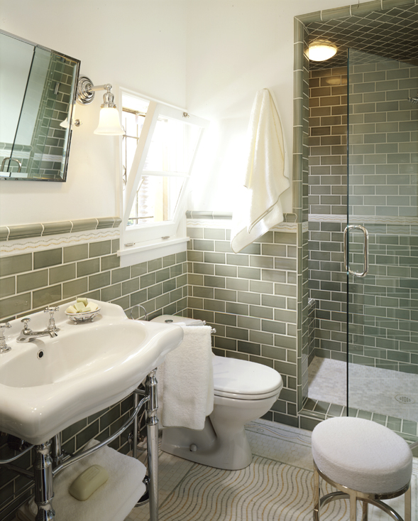
If I could do it all over again, however, I would have left the Belgian tile to its genteel, discreet Belgian interiors and gone straight for a subway tile. It's so modern and fresh yet playful. At the time I wasn't familiar with it, as it's not as big here in Europe as it is in the States, but I kept coming across more pictures which featured this element, and I love it. Big sigh! Coulda, woulda, shoulda!!
If I could do it all over again, however, I would have left the Belgian tile to its genteel, discreet Belgian interiors and gone straight for a subway tile. It's so modern and fresh yet playful. At the time I wasn't familiar with it, as it's not as big here in Europe as it is in the States, but I kept coming across more pictures which featured this element, and I love it. Big sigh! Coulda, woulda, shoulda!!


 |
| This is my favourite!! |
It also looks great in bathrooms!

 |
| I love and adore this grey version! |

 |
| Also looks interesting with dark grout |
Tuesday, September 3, 2013
For the birds
 |
Amid all the metallics, animal prints (which I'm obsessed with, but that's another story) and shaved, dyed and otherwise treated furs in fashion, I suddenly craved something traditional, pretty (yes, pretty) and non-fashiony. Bird wallpaper is what sprang to mind, especially by De Gournay. Dear God, in my next life, let me have a room with De Gournay wallpaper?
 |
| De Gournay |
 |
| De Gournay wallpaper, room by Grant K. Gibson in Elle Decor |


 |
| Antrhopologie |


Monday, September 2, 2013
Hue du jour: Burgundy

It's a colour people associate with autumn. I certainly do. As soon as the wind cools, the first thing I do is exchange my bright summer nail polish for a deep burgundy shade. And just like that I've heralded the new season - even if it is still a few weeks away, school has started and to me that's a sure sign of the end of summer. I like burgundy, particularly in fashion. Interiors are not as easy, though I've found a few great examples. Enjoy!


 |
| Victoria Beckham - this look is so stylish! |
 |
| Alexa Chung |
 |
| Brent Darby |
 |
| Ramon de Abadal |
 |
| Marcos Scarani in Elle Decor |
 |
| Mary McDonald |
 |
| Anne Hathaway for Vogue |
Sunday, September 1, 2013
Look we love: Blinging up baby
 |
| Lanvin 2013 |
I love the play-it-up-play-it-down effect of pairing an over the top necklace with a simple T-shirt or sweatshirt. It really appeals to my longing for glamour while juggling mundane tasks like the school run, groceries and working from home. The first time I ever saw this look was back in the Sex and the City days, when Carrie was wearing a sweater, old jeans, Uggs (I know, I couldn't believe it either!) and a slightly kitsch, obviously fake diamond necklace at the park for a play date with Miranda and Brady (scary how well I remember such inane details, yet can't keep my dentist appointments straight!). I immediately loved the look and, years later, I still do. So this season, I'll be blinging it all the way to the gym and back!


 |
| Rihanna |

Thursday, August 29, 2013
Lucky them!
Sometimes you see a home that is just so fresh and light and - for lack of a better term - happy looking, that you instantly fall in love with it. That's what happened when I was perusing the latest issue of Architectural Digest and stumbled upon the beautiful Beverly Hills home of Lucky Brand executives Dave DeMattei and Patrick Wade. It has once again convinced me that the light in Southern California really is different (read better) than in Holland, and that beautiful neutrals need not be monotonous, particularly when given a pop of colour in the form of bright lamp shade, a vibrant bouquet of flowers or a spunky stool to draw the eye in.
My favourite room is probably the dining room. I love those dove grey walls set off by the crisp, white moldings and slip covers on the chair. And don't get me started on the blue and white Chinese jars! I love, love, love blue and white China (have quite a bit of it in my own home). That pool isn't half bad either, though, is t?! Time for a little bit of California dreaming, me thinks! Seriously, is it wrong to lust after things you can never have as much as I do?


Subscribe to:
Posts (Atom)